
PayBack
Splitting payments has never been easier.
Overview
Vision: Payback is an app that allows users to split payments easily in groups, as well as send and receive money directly. This process page explains how my team and I implemented the Lean UX methodology for this project.
Approach: Lean UX
Team: Nicole Kadom, Sarah Subero, Lauren DeLoach, Mekayla Martin, Hala Canada
My Role: I pitched this project idea to my interaction design 2 class and was chosen as the team lead. As the team lead I was responsible for:
Scheduling/organizing meetings
Scheduling user interviews
Assisted my team members with anything they needed help with
Keeping team members informed and on track
Assigning tasks
Submitting parts of the project
I also moderated and facilitated interviews, conducted usability testing on MVPs, worked on the UI design and prototyping.

Lean UX Methodology
For this project, my team used Lean UX, a design methodology developed by Jeff Gothelf and Josh Seiden. Lean UX is primarily based on creating assumptions and testing them. As stated in the book, “Lean UX prioritizes continuous learning to build evidence for team decisions and ensure ever-improving delivery of products, services, and value (Gothelf & Seiden, 10).”
Our process consisted of two sprints, each three weeks long. During the first week, we completed the Lean UX canvas on FigJam. The two weeks that followed consisted of user interviews, stand-ups, and testing MVPs (minimum viable products) of our prototype. For Sprint 2, we revalidated our Lean UX canvas and moved to high-fidelity prototyping and refinement based on our feedback from usability testing.
1) Problem Statement & Assumptions
Before going through our first sprint, my team did brainstorming together in class to figure out what problem we are trying to solve. This helps ensure that we are designing a product to be an effective solution. Our problem statement:
Problem Statement: The current state of mobile payment apps has focused primarily on transactions between two people and cryptocurrency. Existing products fail to address the need to easily split payments with a group. Our product will address the gap by allowing users to create groups and split payments in customized percentages. Our initial focus will be people who split payments with groups. We will know we are successful when we see users downloading the app and referring their friends.
2) Business Outcomes
After creating our problem statement, we identified core behavior changes that would measure whether or not our problem is being solved. Using our assumptions, we completed an “outcome-to-impact mapping” exercise:
Sprint 1
Lean UX Canvas
We started out by completing the Lean UX canvas on FigJam. The Lean UX canvas “brings together a series of exercises that allow teams to declare their assumptions about an initiative” (Gothelf & Seiden, 33). This allowed us to build team rapport and also establish a shared understanding of the project.
3) Users
Next, we created our proto-personas. Proto-personas are who we assume our users to be based on our assumptions. These personas got revalidated and changed as we progressed on the project and learned more information about our users. In sprint 1, we started with two proto-personas:
4) User Outcomes and Benefits
Using the information from our proto-personas, we were able to answer some hypothetical questions about our user outcomes and benefits, such as:
What is the user trying to accomplish?
Split payments in a group, send and receive money.How does the user want to feel during and after the process?
The user wants to feel a sense of accomplishment and security from being able to send money to friends, family, and peers.How does our product or service get the user close to their goals)?
By using a linear and streamlined set-up process, splitting payments becomes an easier process compared to competitor apps. Two-factor authentication and a security pin will make sure that they feel secure when sending and receiving money.Why would your user seek out your product?
The user would seek out our app if they want a quick, easy, and secure app that allows them to split payments in groups as well as send and recieve money individuallyWhat behavior change can we observe that tells us they’ve achieved their goals?
Getting good feedback from customer support as well as good reviews for the app. Additionally, customers consistently sharing referral codes will also show the app is reaching its goals.
5) Solutions
We did an affinity mapping exercise to brainstorm potential solutions and features, while still keeping our business goals and problem statement in mind.
6) Hypotheses
Using the assumptions we already created, we then created hypotheses. Each hypothesis includes a business outcome, our proto persona, user outcome, and features. This allows us to build minimum viable products (MVPs) to test our assumptions. This hypothesis table became our product backlog, which then got divided into Sprint 1 & 2 backlogs.
Below is an example of a few of our hypothesis statements:

We posted each of our hypotheses on a hypothesis prioritization canvas, this helped us determine which ones were the most and least risky.
7) Hypothesis Ordered By Risk
We determined the risks of each of our assumptions and ordered them from most to least risky. This helped us determine what needed to be built and tested first and also helped us make sure that our features meet the needs of our users. Here is an example of part of our hypothesis table ordered by risk:

8) Product Backlog
For the final step on the Lean UX Canvas, we decided which of our hypotheses to build during sprint 1, and assembled our sprint 1 backlog. This represents everything that we decided to build and test during the first sprint. It is essentially a “to-do” list for the first half of our project. I assigned features to my teammates and myself, then we started creating our first MVP on Figma.
Low Fidelity Prototyping
Since we were on a tight timeline, we started wireframing the riskiest features first to test them as soon as possible. Here is a small section of our low-fidelity prototype:
User Interviews & Affinity Mapping
Each week, my team conducted three usability tests/interviews. These usability tests helped us gain insights into our user’s needs, and whether or not our solutions were meeting them. I moderated and facilitated interviews and usability tests. For usability tests, we gave the users tasks to try and complete, as well as asked their preferences between two different design options. After each interview, we created affinity maps together as a team (pictured below). Our earlier interviews were more question-focused, and became more focused on usability testing as we progressed through the project.
Stand-Ups
We had 3 stand-up meetings per week, these meetings were typically 15 minutes long and allowed the team to come together and update each other on the progress we made individually. This also allowed any team members to voice concerns or ask questions related to the project. We utilized our stand-ups to decide which parts each team member would work on and wrote them down in our FigJam board to prevent confusion and create a sense of accountability. We also wrote down any upcoming interviews or meetings.
Sprint 1 Retrospective:
At the end of sprint 1, we held a retrospective meeting to discuss things such as what went well, what needed to be improved, and how we wanted to do better in sprint 2.
Sprint 2
Revalidation
During the first week of sprint 2, we went back and revalidated the work we did on our Lean UX canvas. We ended up discarding several assumptions that did not prove to be true, as well as refining down our features to just be the ones we needed and would be able to build out by our deadline. We also went back and revalidated our proto-personas, and chose to just have one instead of two. We made this decision because although the two proto-personas were different in their demographics and lifestyles, the way they used the app would primarily be the same.
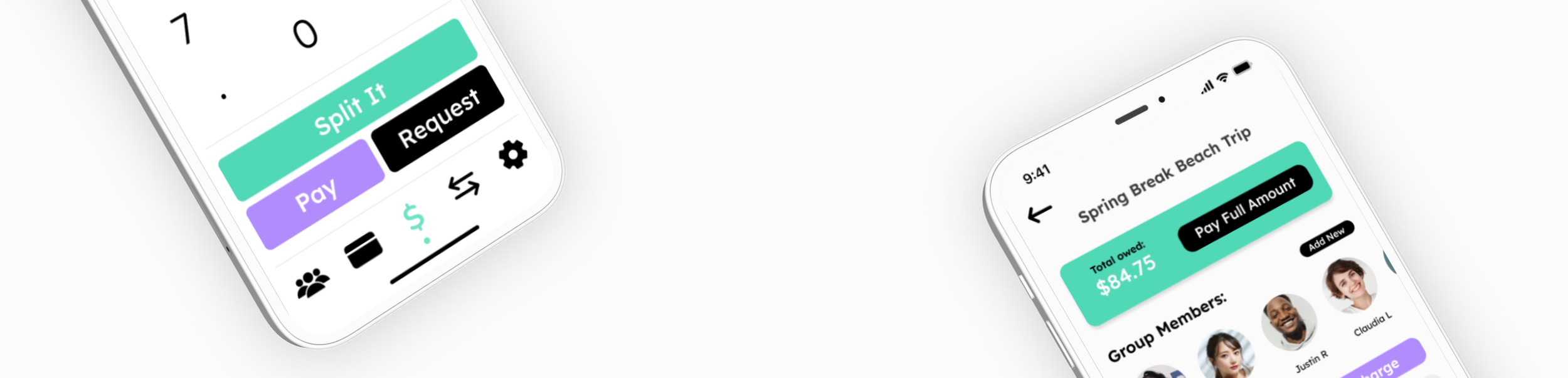
High-Fidelity Prototyping
During sprint 2, my team was focused on turning our low-fidelity prototypes into high-fidelity ones. This meant making sure our app looked consistent across all pages and making the app as functional as possible. Here are some of the screens I designed. I also worked heavily on the groups feature at this time, as well as helping my teammates with any of the other pages in the app.
Usability Testing
We focused a lot on the feedback that was given to us during usability testing from our users and made adjustments based on that feedback. Testing without users allowed us to determine which features were more important than others, and which ones ultimately needed to be left out due to the time constraints of the project. Some of the key takeaways from our usability tests were:
Users were confused about the meaning of the balance on the app
Users wanted the reminder feature to be more straightforward and felt like it was too much effort
Users wanted to be able to set their profile photo during the signup process
Users would rather enter a custom amount rather than a custom percent when splitting payments
Conclusion
After 8 weeks, we finished our prototype for PayBack. Throughout this project, I learned a lot about leadership and the importance of being assertive about deadlines. I also learned that it is okay to usability test work that is incomplete, and the importance of feedback from users. If given more time, I would have loved to take this prototype further by adding animations and graphics for splitting payments in unconventional percentages. Overall, we were able to create a prototype that we can be proud of and learned a lot about Lean UX and the importance of collaboration.


Final Prototype
Press “R” to restart